Choosing Colour Ramps
The mXrap marker style tool has five categories for preset colour ramps:
- Sequential. For representing ordered or numeric information. A single colour range from low to high, or high to low.
- Diverging. For representing numeric information that is considered relative to a central value (the midpoint). Two colour ranges: one from the midpoint to the minimum, and one from the midpoint to the maximum.
- Rainbow. A colour range that covers a rainbow of colours.
- Cyclic. For representing numeric information that cycles, e.g. compass degrees. A single colour range that begins and ends with the same colour.
- Categorical. For categorical information, where the order of values is unimportant and every value should be equally perceptible.
The categories and presets in mXrap are based on Paul Tol's notes, ColorCET, and Kovesi (2015). These are excellent resources which we recommend reading if you want a deeper understanding of why certain colour schemes are better in certain situations, but this page will attempt to give concise advice about choosing good colour schemes for your data. Following the flowchart below it is easy to make a decision for categorical, cyclic, or diverging data, but it can be more difficult to decide between sequential or rainbow styles for the remaining kinds of data.
Sequential or Rainbow
A good way to break it down in general is by what people are looking for in the data: is the form or shape of the data important, or is it more important to be able to match a point to a particular value/range?
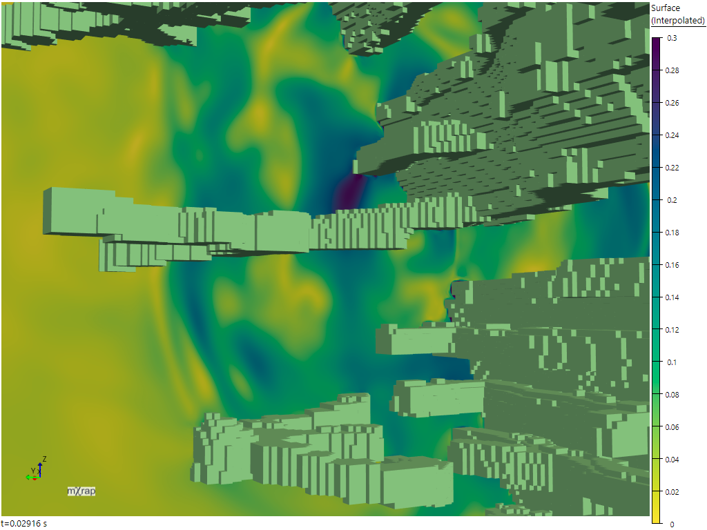
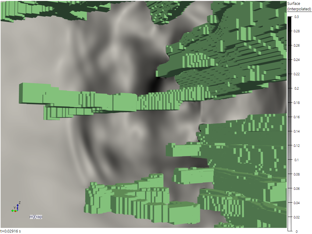
For example with the wave results viewer, sequential or diverging styles are very good at making the shape of the waves easy to interpret. The key to this is that the perceptual lightness of the colours change uniformly in relation to changes in the data values. Because of this, monochromatic schemes are excellent for showing form, although they may not be very vibrant or visually exciting.
| Sequential (Viridis) | Greyscale |
|---|---|
 |  |
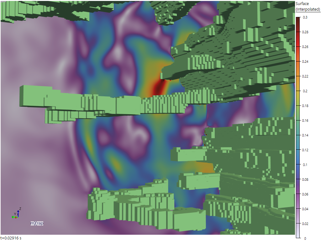
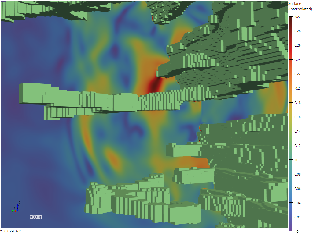
In contrast, the rainbow schemes can make it more difficult to read form. One of the reasons for this is that the rainbows contain reversals in the lightness gradient, "which can upset a viewer's perceptual ordering of the colours in the map" (Kovesi, 2015). This is particularly visible in the off-white to brown rainbow (below left), which starts light and then has a gradient reversal between purple and blue, creating the perception of sharp changes in the display where there are not sharp changes in the underlying values. The purple to brown rainbow (below right) is less severe, but still not as easy to interpret as the sequential schemes above.
| Smooth rainbow (off-white to brown) | Smooth rainbow (purple to brown) |
|---|---|
 |  |
On a larger scale with the DFN block analyser when colouring the excavation surface by unstable block frequency, the sequential marker style makes it very easy to look around the surface and see which areas are more or less prone to block formation.
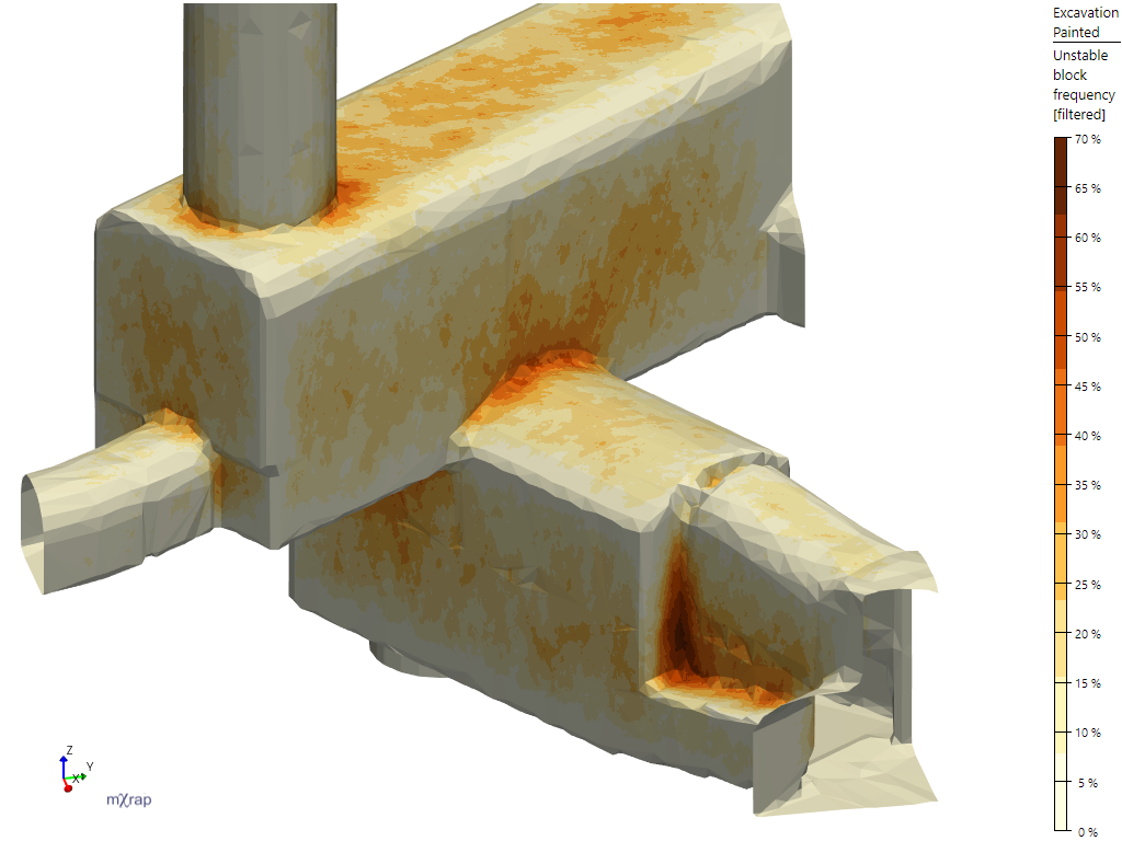
The downside of the sequential schemes is that it's relatively hard to look at a particular point and say exactly what the underlying value is. In this screenshot it's kind of doable because of the banding, but it's not easy because we're not inherently good at matching lightness in different areas (notably, simultaneous contrast can affect our perception of colour and lightness based on the colours in the surrounding area). If you are plotting values on a surface series in a 3D view then this is further complicated by the lighting which is applied to surfaces. For example in the Hudson plot density displays below the same markerstyle is used in both images, but the lightness is different when the camera (not the surface) is rotated.
| YlOrBl (Discrete) | Camera rotated |
|---|---|
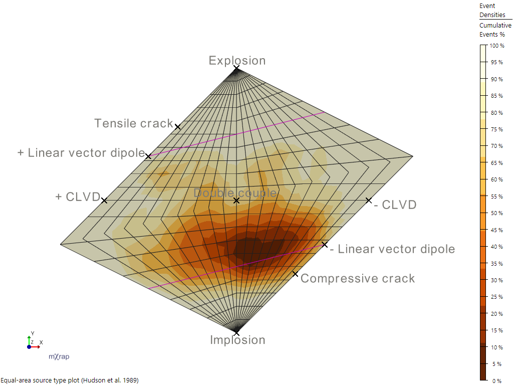 | 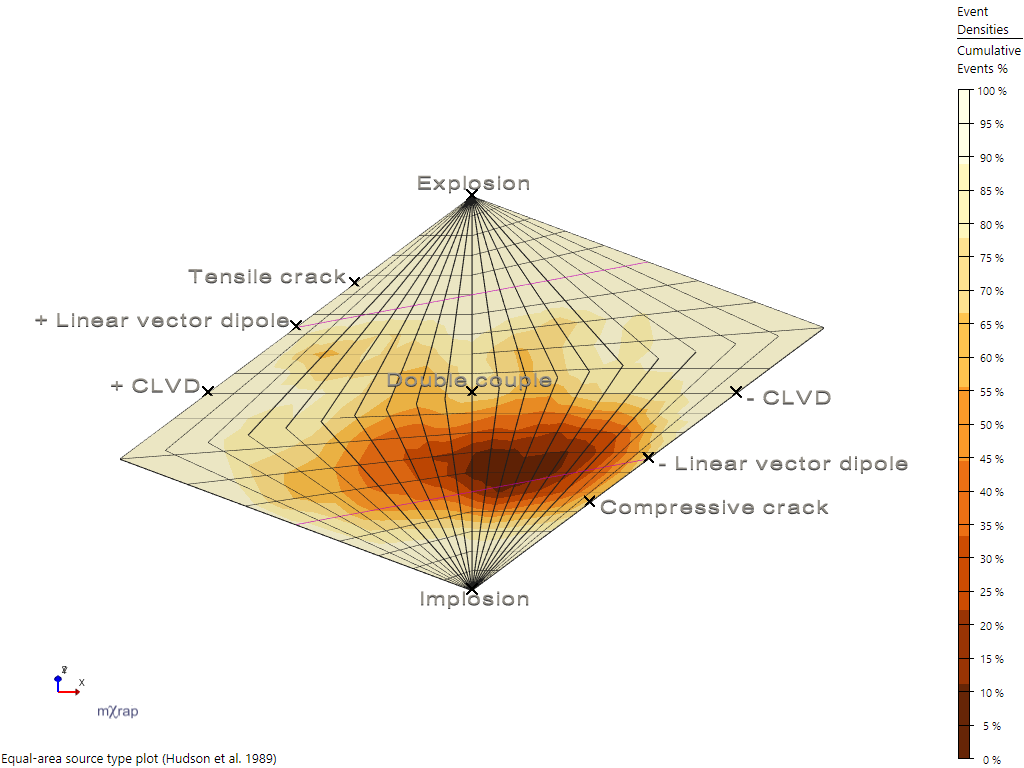 |
As a side note about the banding, while smooth colours can be very visually appealing, they make it even harder to distinguish the values for particular points or areas:

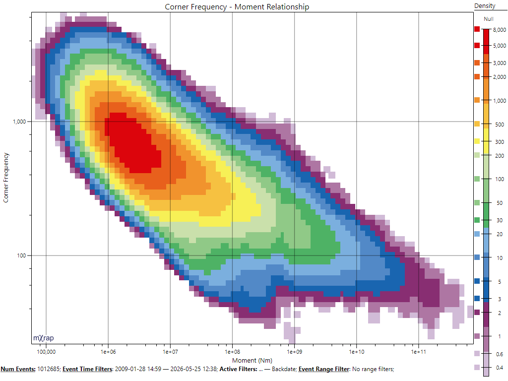
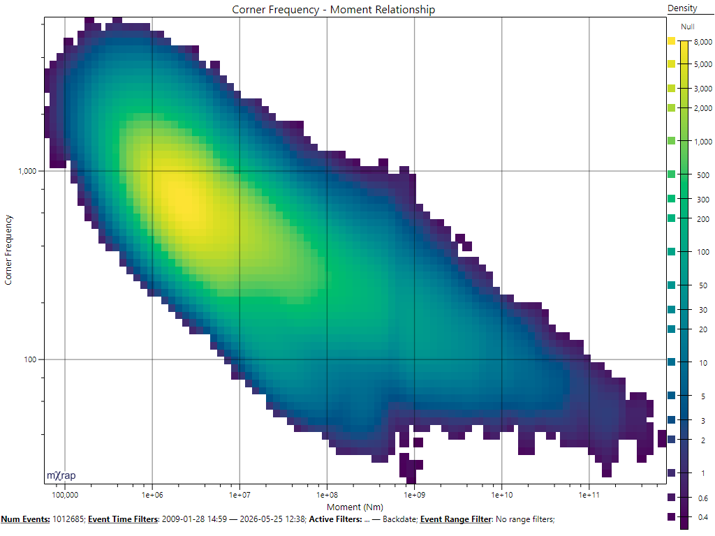
If it's important to be able to match a data point to a particular value (or value range), then the rainbow schemes are going to be better. The f0-Mo chart is a good example of this; it is relatively easy to look at a certain point on the graph and match that to the exact value range on the marker legend.
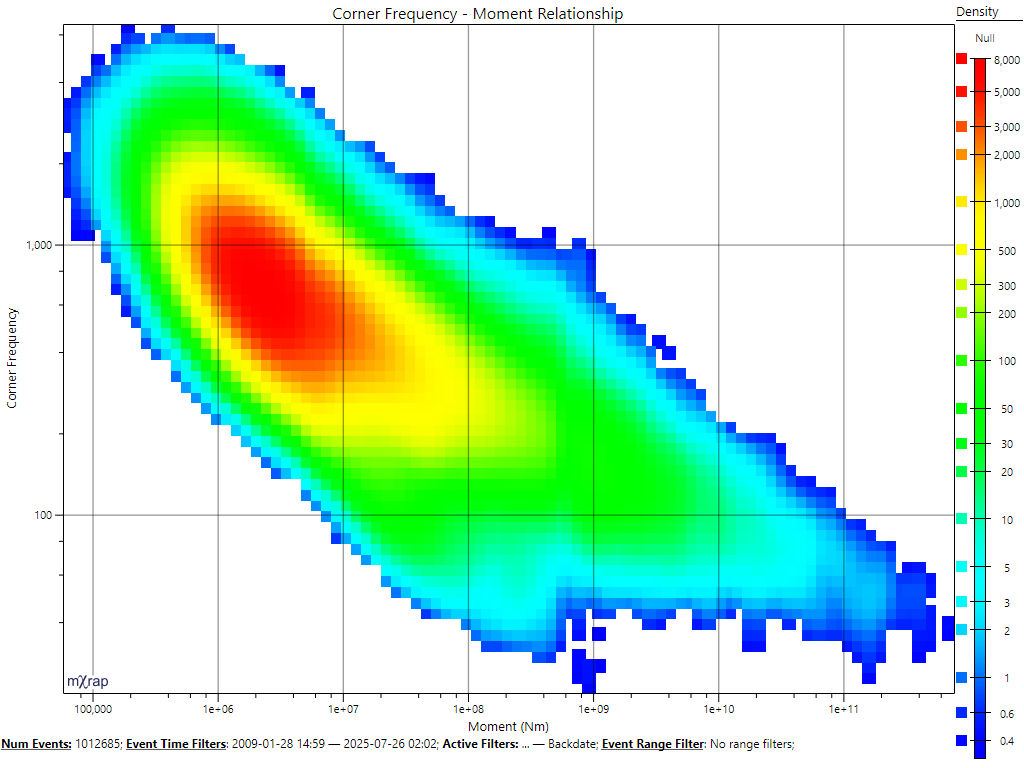
Compare this to the same data plotted with one of the sequential schemes, below. It is harder to look at a certain point and determine what the value range is, but we can see the shape of the density very easily, for example the vertical band of lower density around .
Another factor that's a little more tricky to manage is clashing with other data visible in the same plot. The banded rainbows are good for being able to match values, and they're reasonable at showing shape, but if we have multiple series using that rainbow in the same 3D view then it could get confusing. So in some cases it may be useful to make a series one of the simpler sequential styles just to avoid clashing with other series.
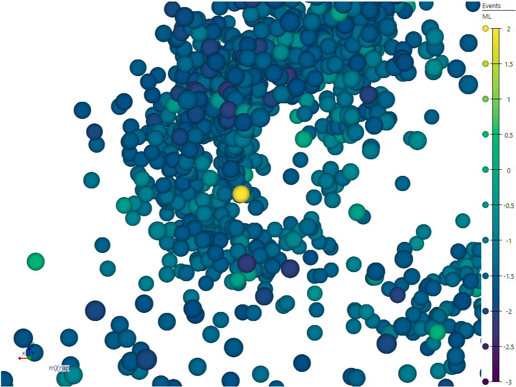
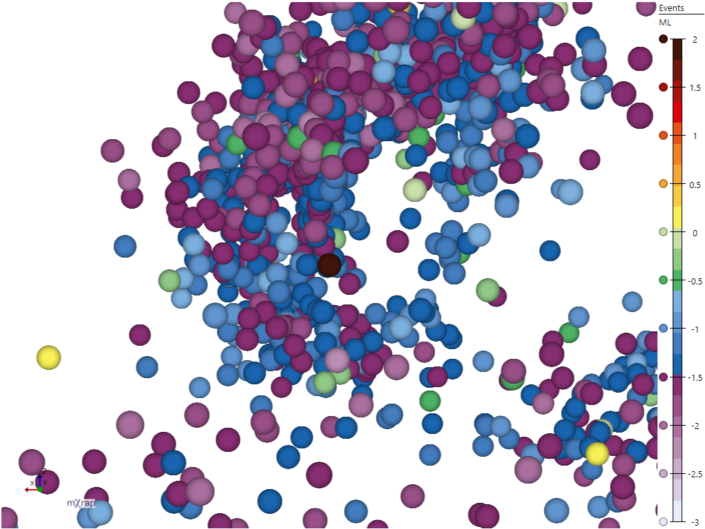
With individual points the question of form vs. metric can still be an important decision, not so much for picking out shapes, but for easily perceiving the relative differences between nearby points. For example with a sequential colour scheme it's quite easy when looking at points near each other to tell which is higher or lower (below left). With the rainbow that takes a bit more cognitive processing, you have to think 'is green higher than blue', or refer to the legend more (below right).
| Sequential | Rainbow |
|---|---|
 |  |
HSV Rainbow
Finally, the HSV rainbow is just outright bad for all cases. It over-emphasises form in sections where the colour changes too quickly, and hides form in other areas where the colour changes too slowly. Those properties also make it bad for matching points to values based on the colour, for example attempting to determine the value of a point in the green or red areas in the image below. Some people are fond of this colour scheme because it is very vibrant or because they are accustomed to it. Sometimes people feel that they can "see more" when using the HSV rainbow; unfortunately features that are more visible are actually features in the scheme itself, not in the data.
| HSV rainbow | Discrete rainbow (23 colours) |
|---|---|
 | |
| HSV rainbow | Greyscale |
|---|---|
 | |
Summary
- Want to see shapes, patterns, easily compare nearby points / see relative differences, or avoid clashing with other data: use a sequential scheme
- Want to be able to look for points with particular values / in particular ranges, or to see a point and determine what value/range it is, shape may also be important: use a rainbow scheme
- Want to make Matt really sad: use the HSV rainbow
Categorical markers
Categorical markers are intended to represent data where the values have no logical ordering. Examples of categorical values are ticked surveys for the distance to surveys filter, ticked filter volumes, elements in a ground support standard, etc. Ideally the colours should be easy to match from a plot to a legend, and it should be possible to differentiate each colour from the others. When you are selecting one of the preset categorical colour schemes you will see a test image with a sequence of tiles.

The top row shows tiles that have an equal mixture of all the colours in the selected scheme. If the scheme is good, then it should be easy to identify the colour belonging to each square. The following tiles are filled with a single category colour, and contain just one square for each of the other categories. If the scheme is good, it should be easy to see each of the other categories.
There are two kinds of presets available: fixed number of colours, and dynamic number of colours. The presets with a fixed number of colours are denoted by text in their name, for example "Bright (6 colours)". These presets work on fixed value ranges, so the input value is expected to map the categories to values 1, 2, 3, etc. These schemes are from the qualitative colour schemes of Paul Tol's notes, if you wish to read more about their design.
The remaining presets can provide a dynamic number of colours. Note that the remaining presets are all isoluminant or close to isoluminant. Because the viewer only has hue to rely on, the size of the plotted value will need to be relatively large for the colour to be distinguishable. These colour schemes do not used fixed values, so they adapt to the minimum and maximum values in your plotted data, or the minimum and maximum defined in the markerstyle Basics page. To get an ideal selection of colours, your category values should be equally spaced between the minimum and maximum. For example values of "1, 2, 3" or "12, 13, 14" are good because they occupy equal spacing between the minimum and maximum, but values of "1, 13, 14" would be bad, because the spacing is unequal, so the colours for 13 and 14 will be very similar (shown below).

Finally, some of the dynamic number of colour presets have colour ranges which begin and end on the same colour, which requires you to adjust the value range to avoid the first and last values having the same colour. The easiest way to do this is by having values counting from 1, e.g. "1, 2, 3, ...", and then setting the marker's minimum to 0 in the Basics page. This ensures that your values are equally spaced around the hue wheel that defines these markers, as shown below.

Cyclic markers
Cyclic markers are specifically designed to represent values in a cyclic range, for example dip direction, so values at the start of the range (0) are coloured similarly to values at the end of the range (360). The marker presets dynamically adjust to the minimum and maximum of the plotted data, or the minimum and maximum specified in the marker's Basics page. For the cyclic nature of these presets to work correctly it is important that the minimum and maximum match the range of possible values, so we recommend specifying this through the marker's Basics page.
Diverging markers
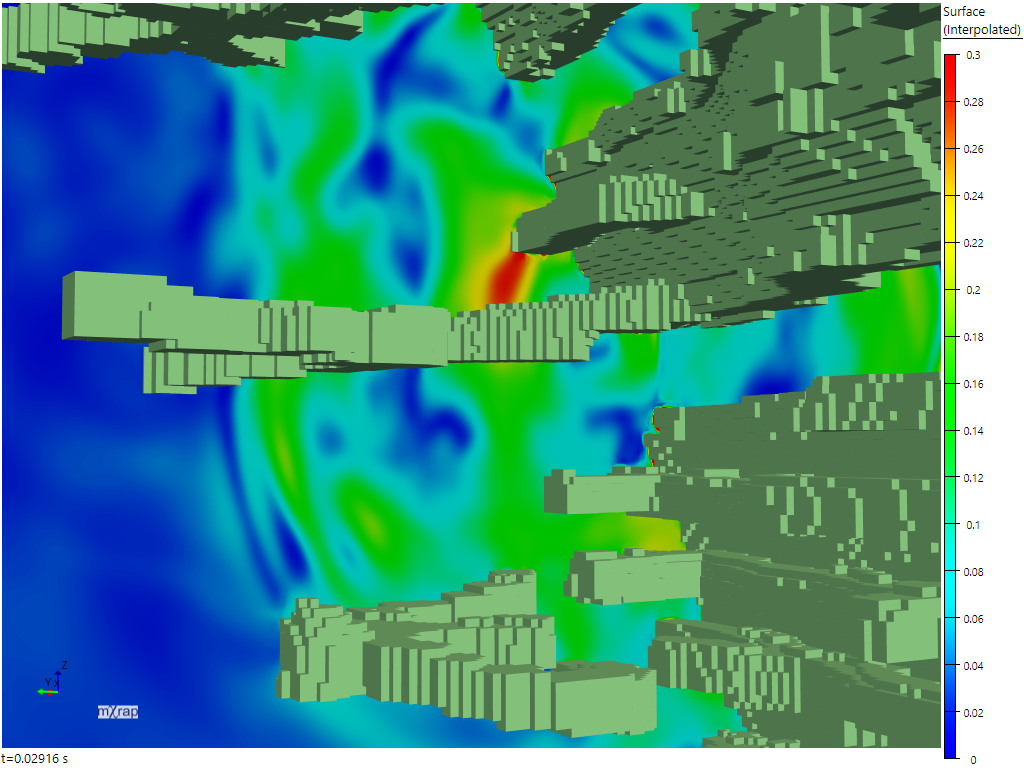
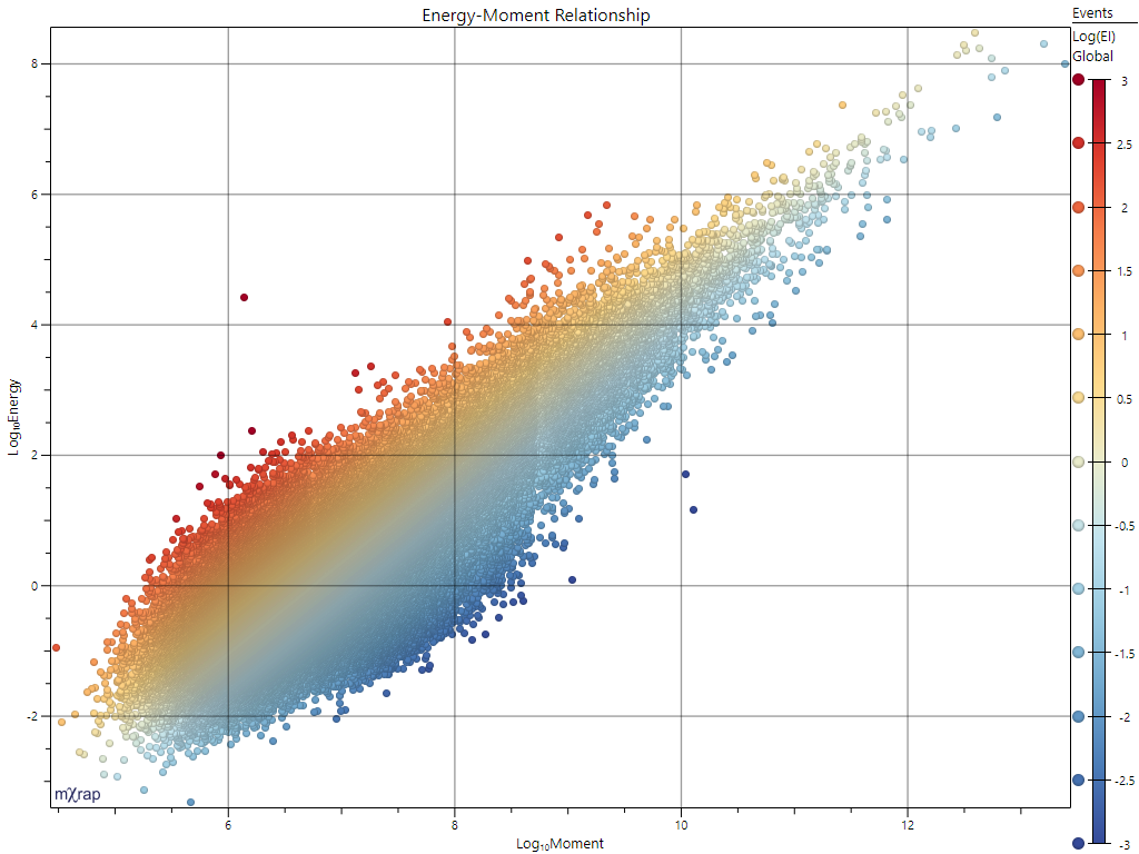
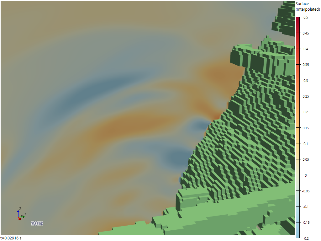
These markers are designed to plot ordered values with a defined midpoint, for example Log(EI) in the Energy-Moment Relationship chart below left, or Y-velocity in the Wave snapshot below right. They are generally designed to have a neutral colour at the midpoint, and then diverge to two different colours at the minimum and maximum, as shown in these plots. However, we also include symmetric options which are effectively mirrored sequential markers designed to show absolute distance from the midpoint.
| Energy-Moment Relationship | Wave Y-velocity |
|---|---|
 | 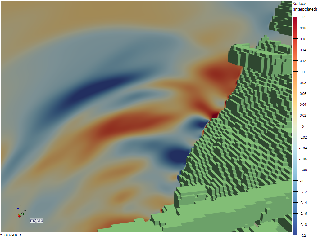 |
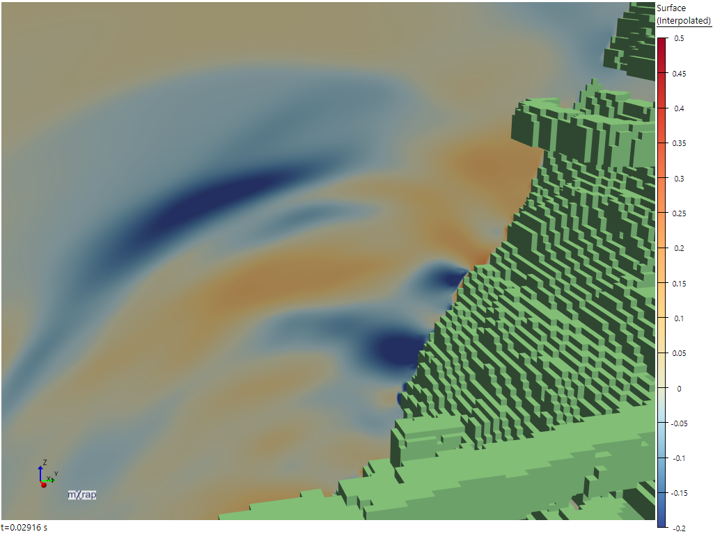
These colour schemes generally follow the design principles for sequential markers described above, but there is one additional important concept for diverging markers: balancing minimum and maximum thresholds. If balancing is turned off then the colouring behaves like two independent sequential colour ramps, one from the minimum value to the midpoint, and one from the midpoint to the maximum value. This means that if the minimum and maximum value have different distances from the midpoint, the colour gradient is different on each side of the midpoint. Consider the Wave snapshot plotted again, with the marker range changed to . We can see in the unbalanced image on the left, a value of looks much more intense than a value of . In the balanced image on the right the values of and have the same intensity.
| Unbalanced | Balanced |
|---|---|
 |  |
References
Kovesi, Peter. Good Colour Maps: How to Design Them. arXiv:1509.03700 [cs.GR] 2015